Client: Slingshot Health
What we did: Strategic messaging, identity, logo
Arming an innovative company with a bold brand
In the early 2010s, Dr. David Berman, a respected gastroenterologist, had a great vision: create a technology platform that would allow patients to bid on provider services. By sidestepping the more complex and costly process of the current healthcare system, patients and providers would have the freedom to bring easier access, affordability, and transparency to their relationship. The platform was launched with the name DokBid, but despite being such an innovative product, the brand name was causing confusion. So Dr. Berman asked us to help.
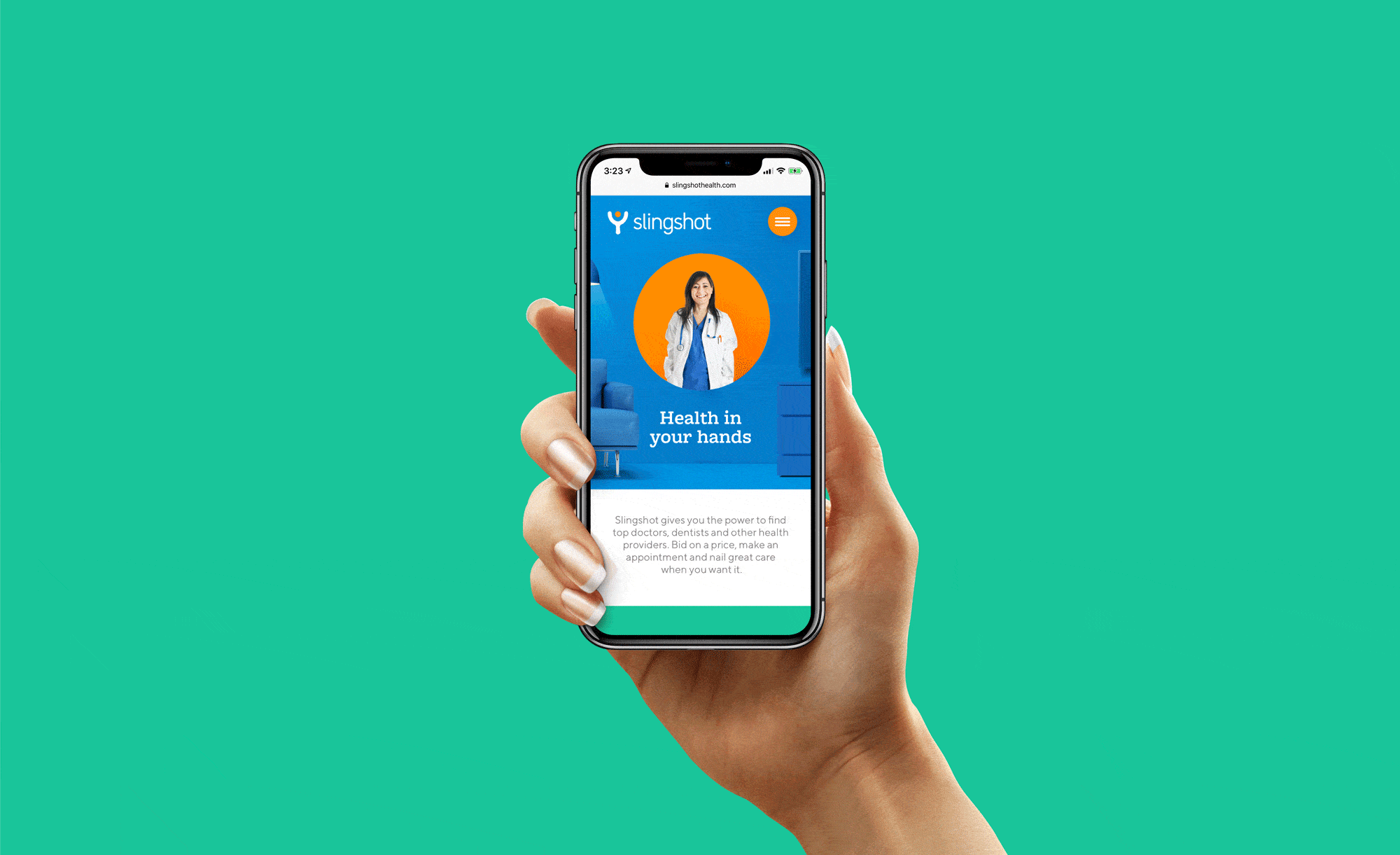
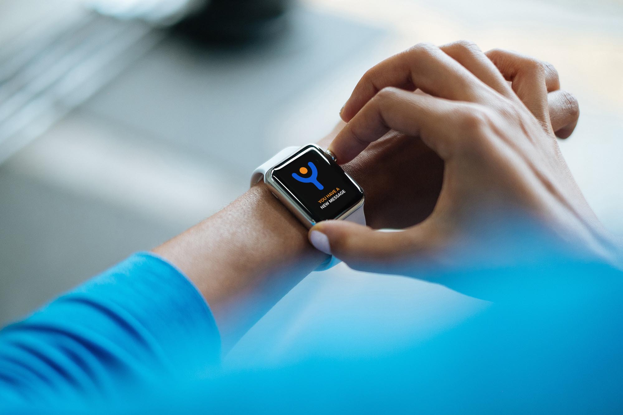
Research revealed that DokBid had spelling and recall issues and lacked broader appeal. Instead of offering a different descriptive name, we saw an opportunity to create a name that reflected a key insight—and told a compelling story. This was a small company on a mission to take on the giant healthcare system, a classic David vs. Goliath scenario. From this insight came the perfect name: Slingshot Health. A logo came next: a stark iconic slingshot that doubled as a patient celebrating victory, alongside a clean, contemporary typeface. Our look and feel furthered this graphic depiction of patient empowerment, while our tagline “Health in Your Hands” completed the theme.

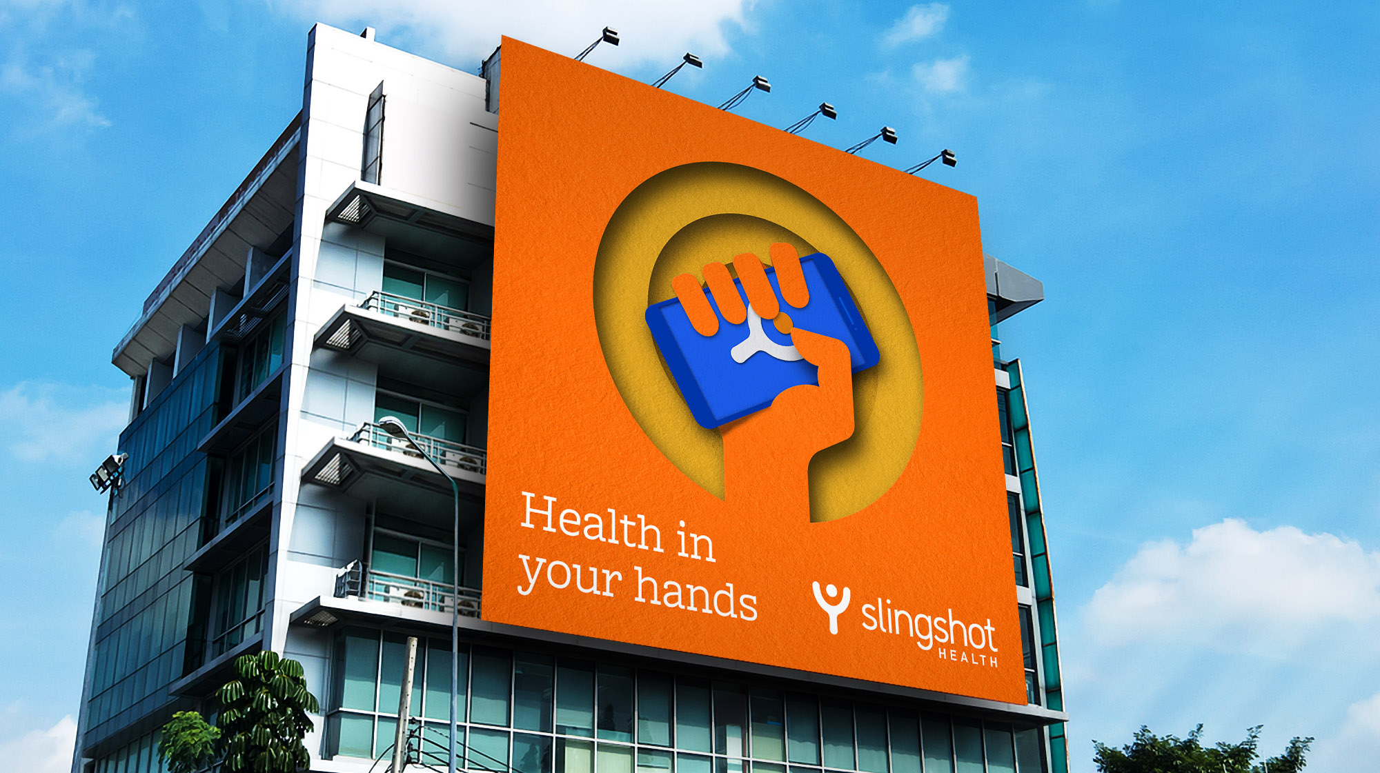
Not only did Slingshot Health give the brand a powerful image that resonated with patients and providers, but it also spoke to the handheld nature of the mobile app and the speed of getting the care you need at the price you want. Now that’s a story worth celebrating.